The same job, before and after AI
Nine parts of how I work, and what changed
| Before AI | After AI | |
|---|---|---|
| Competitors | Reading their whole site by hand | AI reads it, I check what matters |
| Research | Google, all the way to page 10 | Search results, summarised and checked |
| Visual directions | Days of exploring in Figma | Just enough to pick, then build it |
| Design system | A Figma library dev rebuilt anyway | Coded components, Storybook-style |
| Handoff | Pixel-perfect screens, shipped differently | Devs use the same components |
| Prototype | Wiring every frame by hand | A real app, nothing to wire |
| Testing | Half the buttons did nothing | A live link where everything works |
| Feedback | After dev had already built it | Recordings, then discussed in Figma |
| Documentation | A Figma file that drifts from code | The built app, sent to Figma via MCP |
Before AI, a lot of my time went into preparing an idea before anyone could try it. I’d read competitor websites page by page, write down what stood out, and spend hours searching Google for anything I might have missed. Exploring different designs could take a few more days.
And some of that work didn’t survive anyway. I’d create components in Figma, and the developers would create their own in code. I’d finish the screens, but what they built would look a bit different. Testing took its own preparation too. I’d connect every screen in Figma so someone could click through the design, then watch them click the one button I hadn’t connected.
AI took a lot of that work off my plate. Deciding what to build and checking whether it works is still my job, but I can get a working version in front of people much sooner. Here’s what that looks like now.
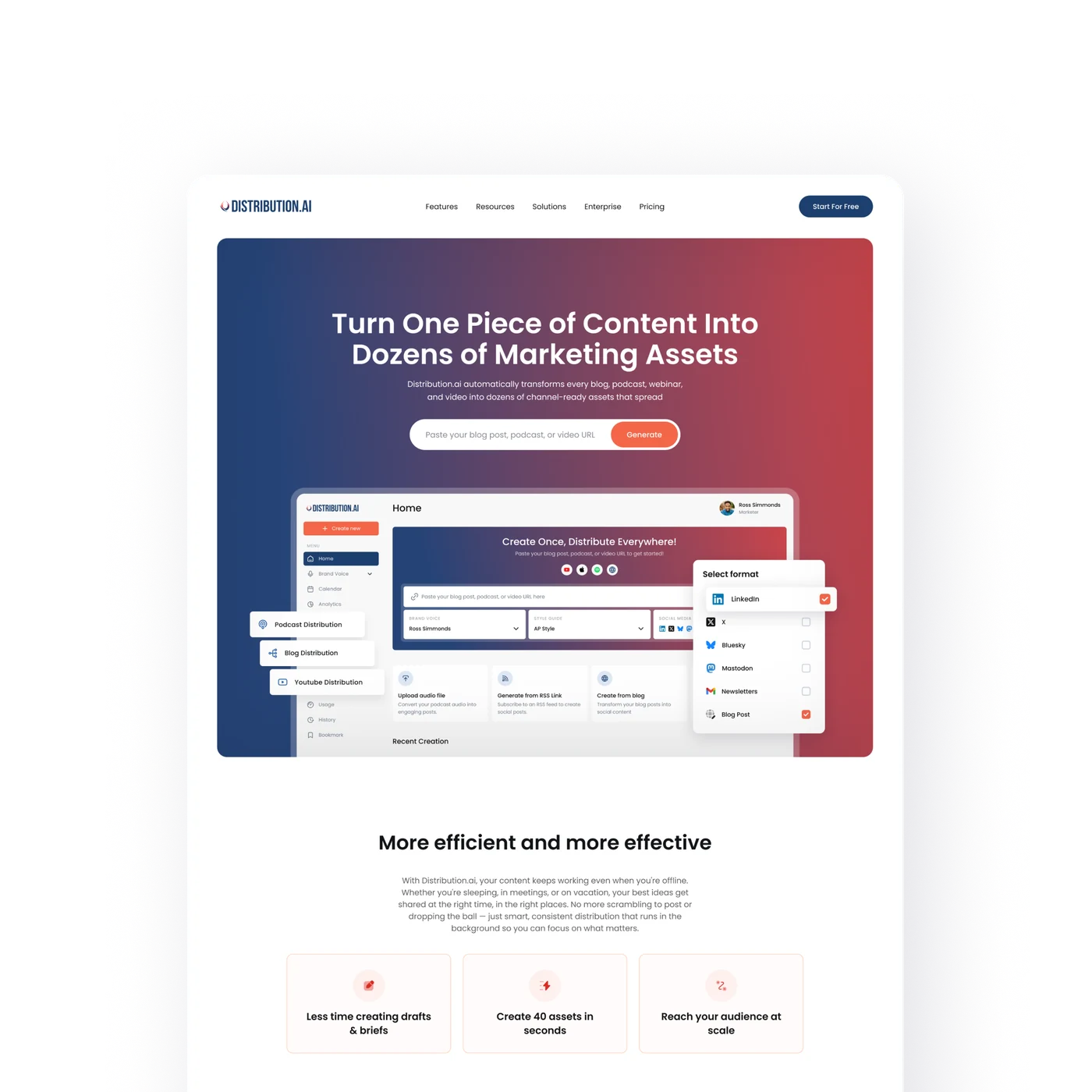
Most of what you’ll see below comes from a real product, Distribution.AI, where I’m the designer. The prototypes and screens are from actual work on it. Where something is drawn instead, it’s marked as an illustration.
What changed
When a working version took weeks to build, it made sense to settle as much as possible before building it. I’d finish the screens, think through what could go wrong, and explain how everything should work before sending it to the developers. The problem was that some questions only had answers once someone used the thing. I could spend days working through a design and still miss something obvious in the first few minutes of testing.
Now I can build a version myself while I’m still figuring it out. Research and exploring come first, as they always did, but I get to a working link much earlier. Then I watch what people do and use that to decide what needs changing. Sometimes a button is confusing or there are too many steps. Sometimes I realise I misunderstood the problem. Either way, I’d rather find out before spending another week on it.
Research once, then loop on something real
How I work now
Research without hours of searching
I need to understand the problem and see how other products solve it, same as before. What changed is how much of the reading I do by hand. I ask AI to go through competitor websites, find relevant information, and pull out the useful parts. Then I read what it found, check the important sources, and decide what matters for the thing I’m working on.
There’s still work in that last part. A clear summary can make an answer sound right even when the information behind it is wrong or out of date, so I check. But I spend less time collecting information and more time deciding what to do with it. By the end, I want a short list of things to try and questions to answer when people use them.
Exploring designs without spending days
Figma is where I explore. It’s the quickest place for me to put a few designs next to each other and work out which one feels right. The difference is that I don’t finish every option anymore. I explore enough to choose a direction, then build it, because there’s only so much I can learn by looking at the screen.
A form might look clear in Figma, but I learn more when someone fills it in with their own information. The content might be longer than I expected, or a question that seemed simple might take them a while to answer. Once I reach those kinds of questions, I’d rather try the design than spend another day polishing it.
Building a working prototype
The part I don’t miss is connecting screens in Figma. I used to set up each interaction so people could click through the design, and if they tried something I hadn’t connected, I had to explain what was supposed to happen. Now I build a working prototype with Claude Code, put it online with Vercel, and send people the link. They can enter their own content and try the steps I’ve built without needing a Figma account or a walkthrough from me.
That changes the feedback I get. People bring content I didn’t prepare, go back to change things, and take routes I hadn’t thought about. Some stop before finishing. Those are all useful things to see while it’s still a prototype, because the design is still easy to change.
Components the developers actually use
I don’t build components in Figma anymore. I build them in code, as a component library in the style of Storybook, where every component and its variations sit on one page the whole team can open.
That fixes the problem from before. The developers don’t have to recreate my components from a Figma file and hope they match. They use the same ones I built the prototype with, so what ends up in the product looks like what people tested.
Figma is still part of this, just in a different role. Besides exploring, I use it to keep a record of where the design ended up. Once a screen is settled, I send it from Claude Code into Figma through the Figma MCP connection. That way, the file reflects what I actually built, including the changes I made after people tried it.
Watching people use it
Once the prototype is live, I add PostHog, mostly for the session recordings. These let me replay how people use it, and they turned out to be more useful than I expected. People don’t always mention every problem when I ask for feedback. They might pause at a question, scroll past something important, or leave before finishing. A recording lets me see those moments without being there to explain anything.
Before anyone opens the link, I write down two or three things I want to learn. Can they find what they need? Do they understand what to enter? Do they finish the steps? That gives me something specific to watch for. Otherwise, it’s easy to spend an hour watching recordings and treat every pause as a problem, even when I don’t know what caused it.
Comparing two versions on the same page
When there are two designs worth trying, I build both and add a small dropdown labelled “A/B test.” Anyone can switch between them on the same page, which makes it easier to discuss the differences. We can try the same task in each version without having to remember what the other screen looked like or imagine how it would work.
The label needs a caveat, though. In a proper A/B test, separate groups use different versions and you compare the results. Here, everyone can see both, so I’m learning what they notice and prefer when they compare them. That’s still useful for making a decision, as long as I’m clear about what it tells me. Once we choose a version, I remove the dropdown.
Testing the first few steps
Onboarding is where this helps me most. It’s someone’s first experience of the product, and a lot of it is hard to judge from finished screens. In my Figma prototypes, the fields were usually filled in already and the result was ready whenever someone clicked. People could move through the design without doing the work the real product would ask of them.
In a working prototype, they have to enter their own information, wait for the result, and decide whether to continue. A short form can ask for something they don’t have ready. A result can take longer than they’re willing to wait. Those things change how the whole experience feels, and a working prototype is the only place I get to see them early.
What this means if we work together
The practical difference is that you get to try the idea earlier, while there’s still room to change it. I can send you a working link, you can open it on your phone or computer, and we can talk about what happened when you used it. There’s less explaining how something is supposed to feel, because you’ve already tried it.
You can also watch other people use it before we commit to the full build. And when we disagree about a design, we can build both versions and compare them instead of arguing it out.
Not the final version
I don’t think this is the final version of how I work. The tools keep changing, and some of what feels fast now will probably feel slow later. What I want to keep is the order: understand the problem, build something people can try, and use what I learn to decide what needs changing. I still get things wrong. I just get to find out sooner.